


Why LaCroix's label is stuck in the aughts
The seltzer company gave its fans what they asked for.
In 2015, the New York Times published a Letter of Recommendation by Mary H. K. Choi, who wrote about a strange yet addictive beverage.
“Initially, I thought it was one of those food-as-personality things, where otherwise dull people develop an ‘obsession’ with something ostensibly exotic — typically Nutella, Sriracha or Fernet-Branca — and pass it off as a quirk,” Choi wrote. “But the first time I cracked one open and took a swig, I understood. LaCroix sparkling water is absolutely delicious.”
Choi probed her initial disdain for LaCroix and concluded that it came down to the package design: “With its bootleg Van Gogh swirls and the not-quite Yves Klein blue logo, LaCroix would look right at home nestled in a neoprene koozie screen-printed to look like an acid-washed denim jacket….The inside of my recycling bin has begun to look like a Cirque du Soleil poster.”
Four years later, Choi is a bestselling novelist and LaCroix is a sensation that still comes in that same ugly-terrific can.
LaCroix isn’t the first seltzer to take off; it’s what happens to be popular right now. The old timey concept of “taking the waters” actually referred to carbonated spring water, which was said to soothe nerves and heal bodies.
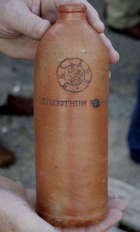
The most famous spas were in Europe, but eventually a German spa called Niederselters began bottling and shipping the carbonated water in special clay jugs. In the US, Niederselters morphed into “selters” and eventually “seltzer,” its enduring name today.
In the US, pharmacists began analyzing the mineral and salt contents of these European waters, trying to replicate the spa water on their own. (This explains why soda fountains and pharmacies are so closely linked.) As pharmacies began to add citrus flavors to improve seltzer’s taste (and later, sugary syrups and ice cream), Congress couldn’t decide if imported seltzers like Perrier should be taxed as luxury goods or medicine. Eventually, the debate ceased to matter. Americans were hooked on seltzer, and it was here to stay.
Curiously, scientists recently determined that seltzer’s appeal isn’t in its carbonation. For the Medium publication Elemental, reporter Maya Kroth writes:
It started with a trial in which participants were asked to drink carbonated beverages in a high-pressure chamber; under pressure, bubbles couldn’t actually form, but subjects still reported tasting the fizz. Inspired by those findings, scientists discovered that effervescence is experienced not as a physical sensation of bubbles bursting on the tongue, but by the sour taste buds, which register the tanginess of the carbonic acid released in the fizz. So it’s not the bubbles but the chemistry that gives seltzer its liveliness.
Perhaps that helps explain this surprisingly popular poll:

Or maybe not. Either way, it brings us back to LaCroix. If seltzer is so enduringly popular, what sets LaCroix apart? And why do the cans look like clip art?
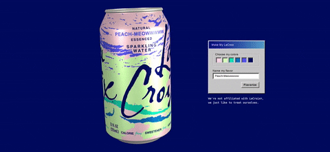
Bon Appetit traced the history of LaCroix’s design and as it turns out, consumers chose the “tacky-chic” look themselves. In 2002, a designer named Lyle Zimmerman was hired to create a new look for the twenty-year-old brand.
Zimmerman crafted 20 options, which executives whittled down to just three finalists. For the final decision, the designs were shown to focus groups of consumers, who overwhelmingly voted for the colorful, eye-catching design we have today.
“In a sea of logos that were more sedate, precious in size, and often sans serif, the script denoted movement, energy, and fluidity—all traits applicable to water and especially the effervescence of LaCroix,” Zimmerman told Bon Appetit.
It wasn’t a close contest, either: “We weren’t surprised that it was consumers’ preferred option, but we were surprised by how overwhelmingly it was preferred. It was a landslide.”
Other designers are horrified by what they dub a crass and “populist” style, but in 2019 – a year when the Met Gala’s theme was “camp” – there’s nothing more appealingly stylish. LaCroix’s stock prices have soared, and the cans frequently star in Instagram posts, where they’re just as eye catching as they are on grocery shelves.
Something else

GIF by Summerhouse contributor Lenora Yerkes
Last week, the journalistic tables turned, and I was interviewed by DCist! I talked about what it’s been like to build a new digital magazine for DC. I will also be on Brightest Young Things’ radio show tomorrow at noon, so tune in if you’re curious.
We’ve got 9 days left (!) to hit our Kickstarter goal, so this is a great day to pledge if you’re so inclined. If everyone on this email list pledged $8, we’d hit our goal by EOD!